Styled Components button components
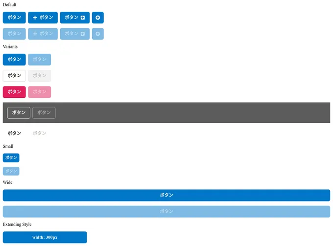
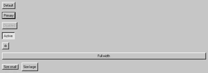
25 buttons are styled using Styled components. A button is a clickable interactive element that triggers a response. You can place text and icons inside of a button. Buttons are often used for form submissions and to toggle elements into view. Styled-components is a styling library that allows you to write styles in JavaScript at the component-level. This technique is known as CSS-in-JS. Styled components is used to style 10 projects.
25components78storiesLast updated today
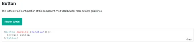
Button

Button


Button

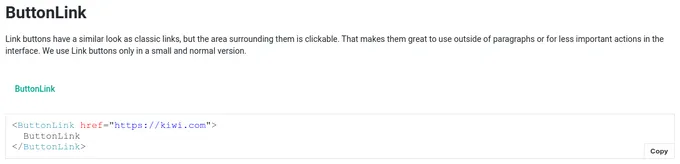
ButtonLink

Button

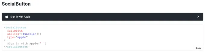
SocialButton
Button

Button

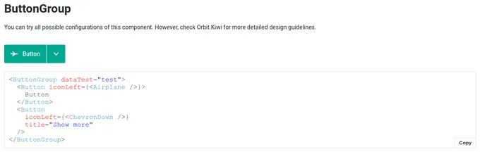
ButtonGroup

Button
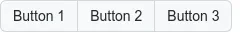
ButtonGroup
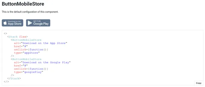
ButtonMobileStore

IconButton

Routed button


Button

SegmentedControl.Button

SegmentedControl.IconButton

IconButton

LinkButton
ButtonArrow