Storybook Design System
The Storybook design system codifies existing UI components into a central, well-maintained repository. It is built to address having to paste the same components into multiple projects again and again. This simplifies building UI's with Storybook's design patterns.


Avatar
5
AvatarList
7
Badge
3
Breadcrumb
1
Button
9
ButtonToggle
5
Cardinal
15
Checkbox
4
Clipboard
4
ClipboardCode
2
ClipboardIcon
1
ClipboardInput
2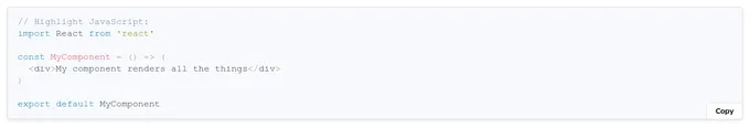
CodeSnippets
3
DisplayCard
7
FormErrorState
3
Header
6
Heading
1
Highlight
13
Icon
3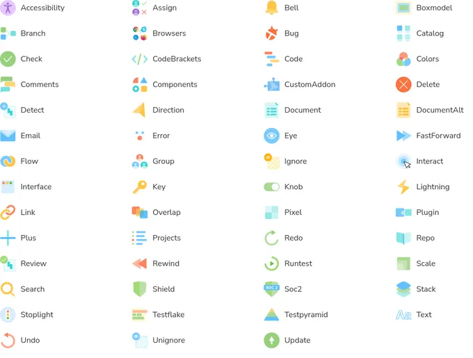
Images
1Addons in this project
Actions
Get UI feedback when an action is performed on an interactive element
3.5M
Downloads
- + 2
Docs
Document component usage and properties in Markdown
2.9M
Downloads
- + 2
Accessibility
Test component compliance with web accessibility standards
1.1M
Downloads
- + 2
Chromatic
Automate visual testing across browsers. Gather UI feedback. Versioned documentation.
483k
Downloads
- + 5
Storysource
View a story’s source code to see how it works and paste into your app
407k
Downloads
- + 2
Similar projects
Add your project


Natura Design System


Narmi Design System
