SAP fundamental-styles
Fundamental Library Styles is a light-weight presentation layer that can be used with developers' UI framework of choice (e.g.Angular, React, Vue, etc.). Developers can build consistent Fiori apps in any web-based technology, by combining Fundamental Styles, library of stylesheets and HTML tags.

- + 24

Action Bar
1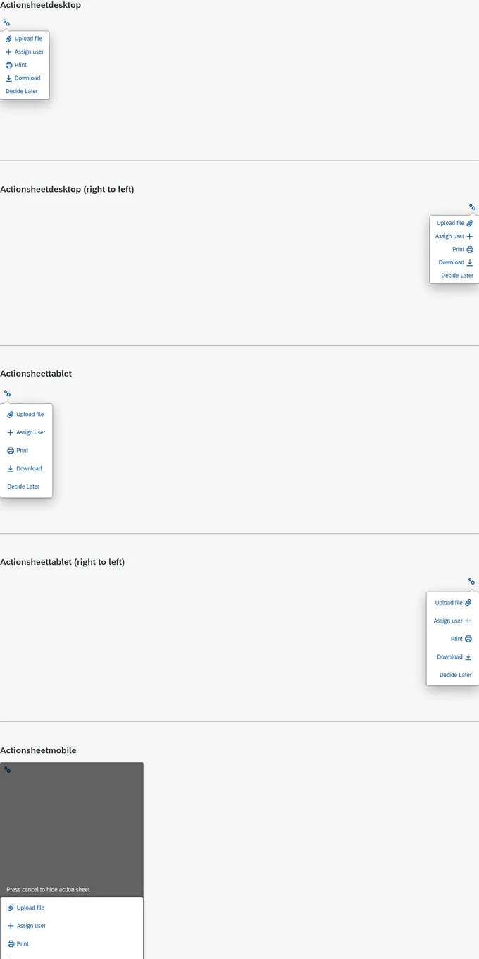
Action Sheet
1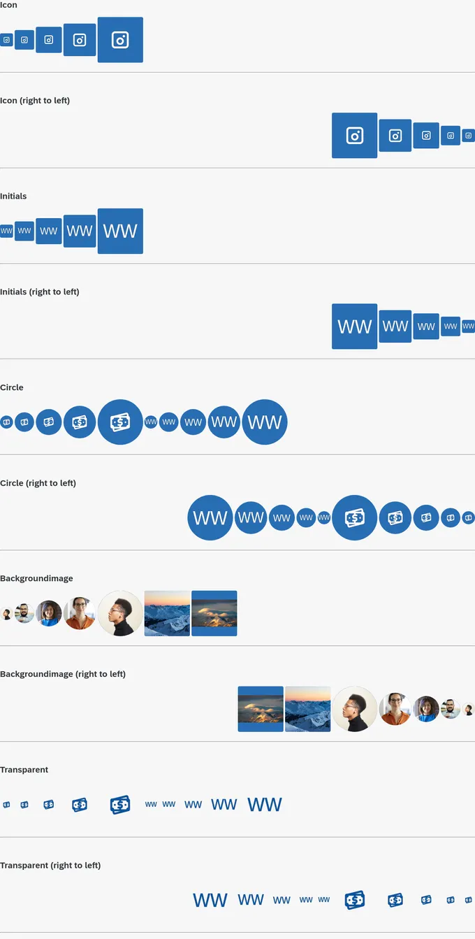
Avatar
1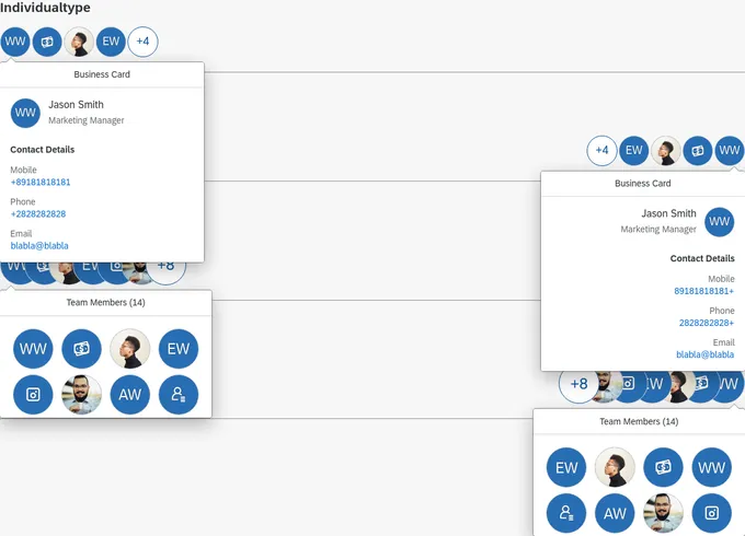
Avatar Group
1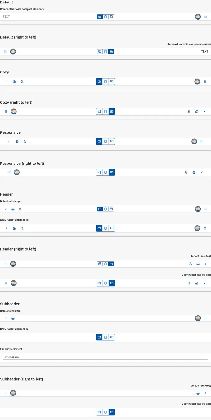
Bar
1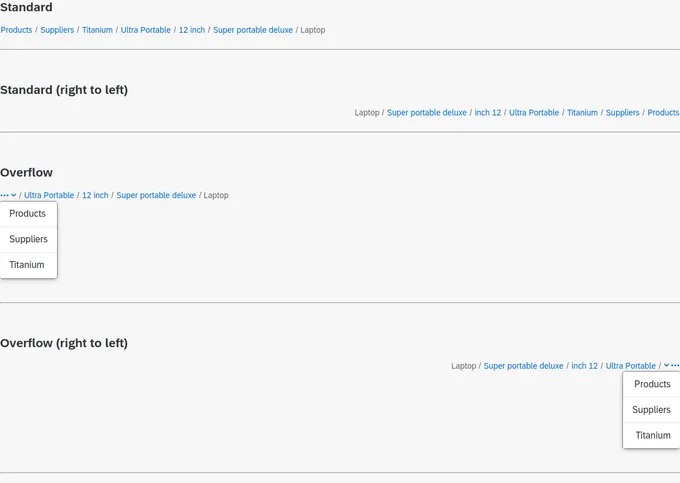
Breadcrumb
1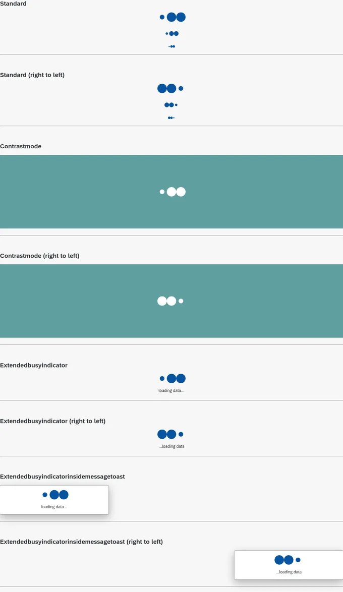
Busy Indicator
1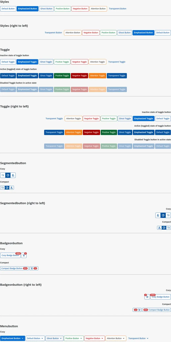
Button
1
Calendar
1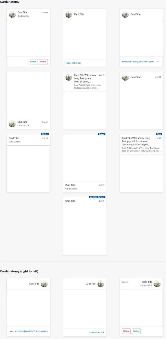
Card
1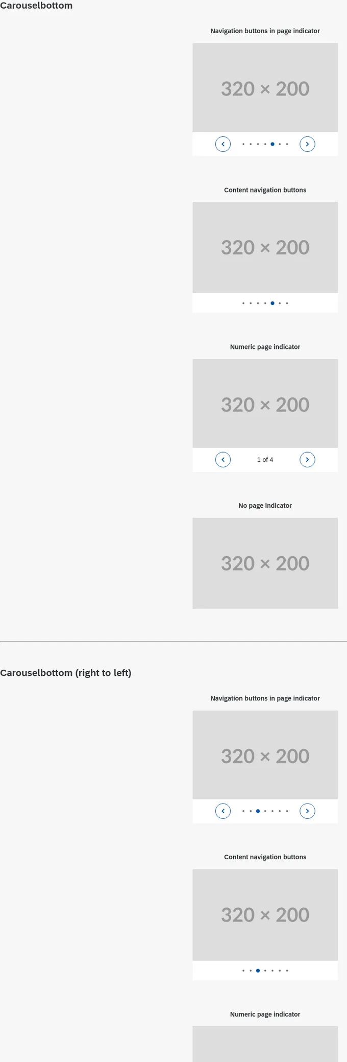
Carousel
1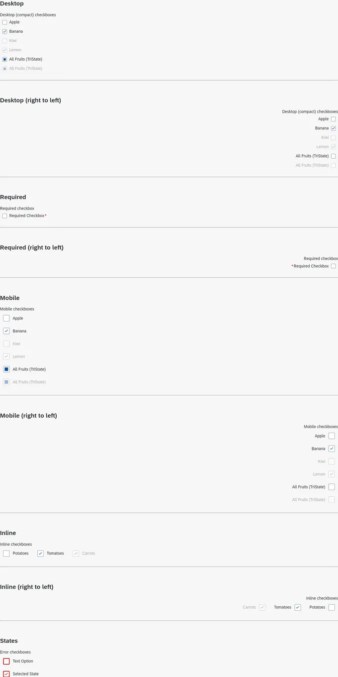
Checkbox
1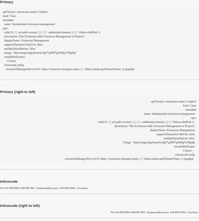
Code
1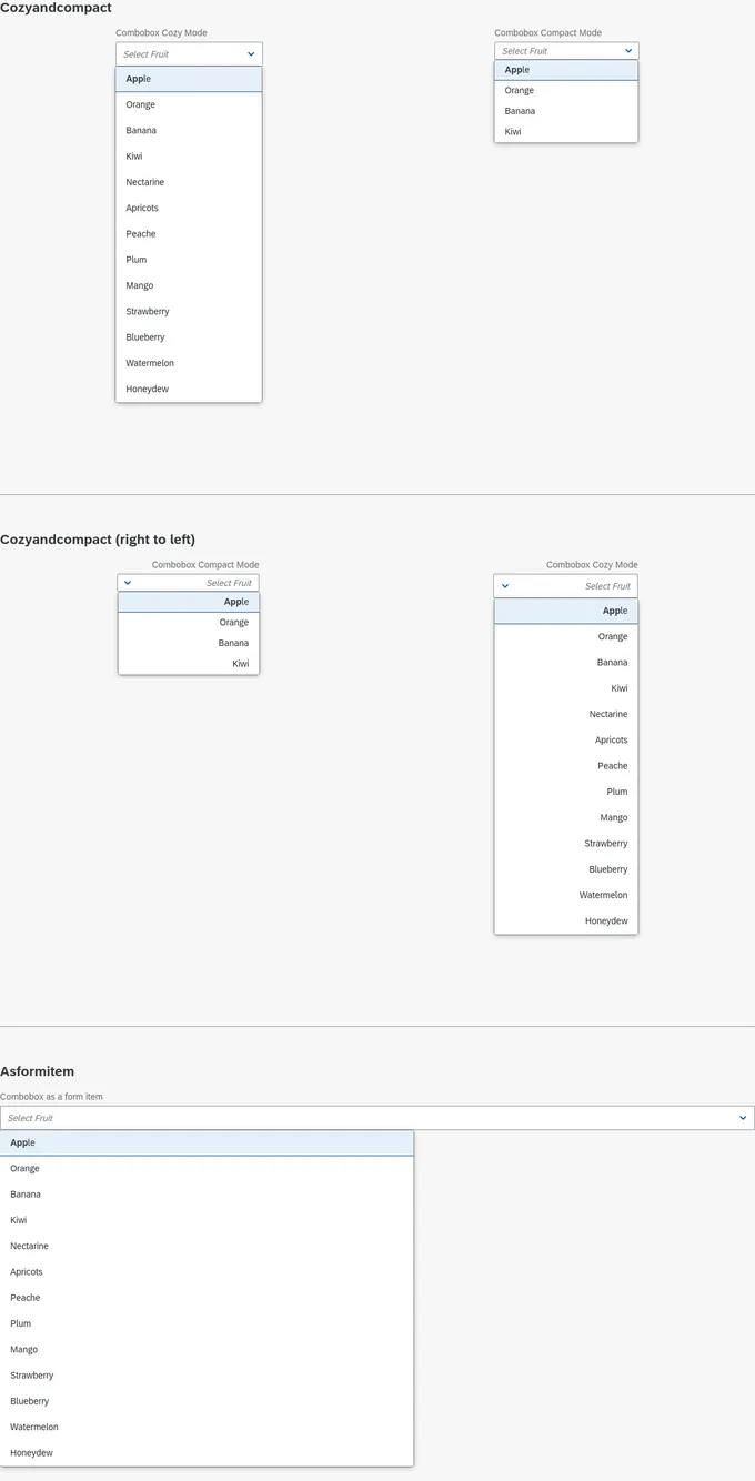
Combobox Input
1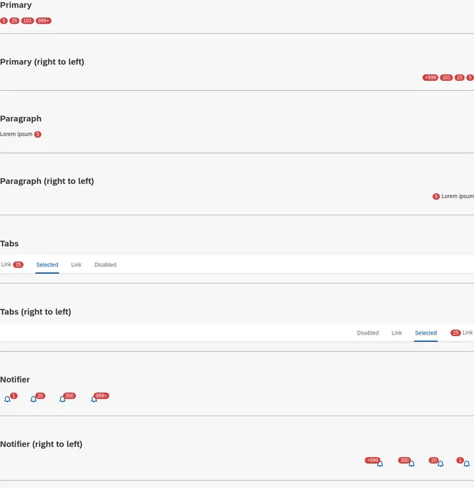
Counter
1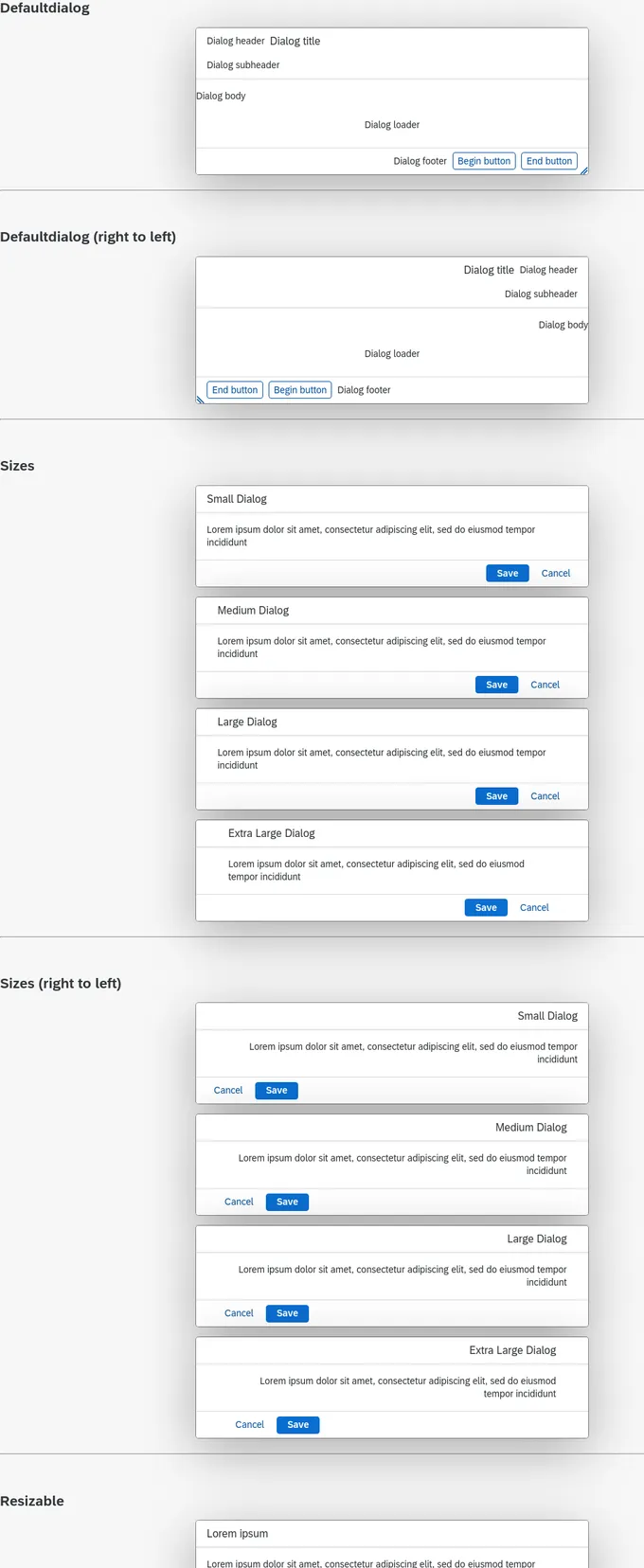
Dialog
1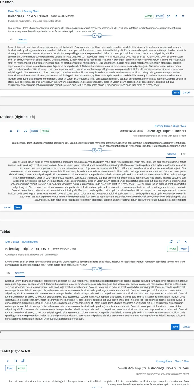
Dynamic Page
1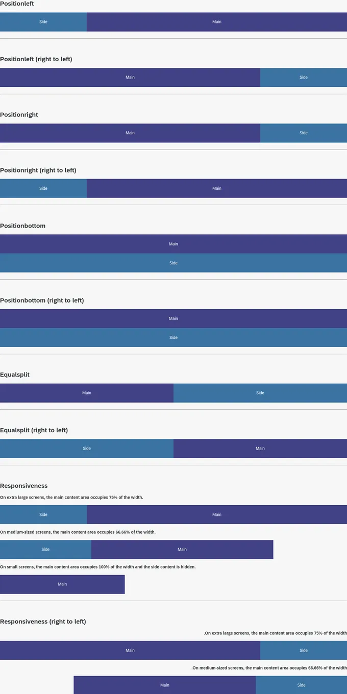
Dynamic Side Content
1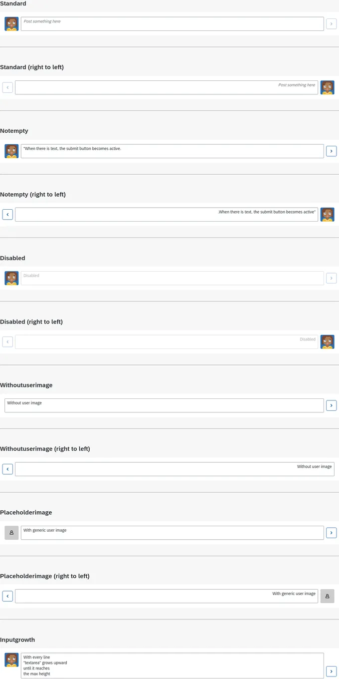
Feed Input
1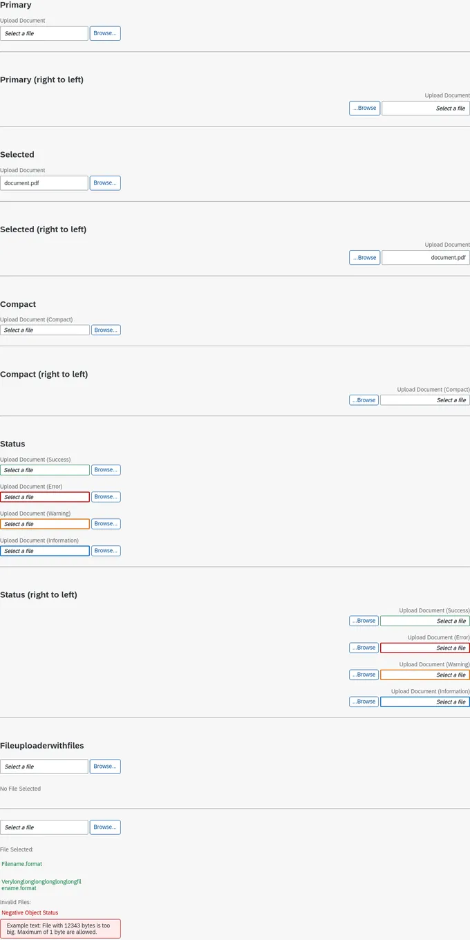
File Uploader
1Addons in this project
Actions
Get UI feedback when an action is performed on an interactive element
2.8M
Downloads
- + 2
Docs
Document component usage and properties in Markdown
2.4M
Downloads
- + 2
Viewport
Build responsive components by adjusting Storybook’s viewport size and orientation
2.7M
Downloads
- + 2
Controls
Interact with component inputs dynamically in the Storybook UI
2.3M
Downloads
- + 2
Toolbars
Create your own toolbar items that control story rendering
2.2M
Downloads
- + 2
Links
Link stories together to build demos and prototypes with your UI components
2.1M
Downloads
- + 2
Accessibility
Test component compliance with web accessibility standards
816k
Downloads
- + 2
CSS Resources
A storybook addon to switch between css resources at runtime for your story
5.5k
Downloads
- + 2
Similar projects
Add your project


React Table Library

