
Storybook 9
The lean, mean component testing machine

Storybook’s superpower is showing every possible state of your UI in one place, from a basic button to an obscure page. That makes it the perfect foundation for automated testing.
With Storybook 9, we partnered with the latest generation of testing tools to build the ultimate component testing tool. Vitest ships the fastest test runner available. Playwright delivers unmatched browser fidelity. And of course, Storybook is the easiest way to express UI variations.
- ▶️ Interaction tests: Verify functionality by simulating user behavior
- ♿ Accessibility tests: Detect, diagnose, and fix WCAG violations
- 👁️ Visual tests: Check for appearance bugs down to the pixel
- 🛡️ Coverage reports: Understand which code is tested at a glance
- 🚥 Test widget: Click to run a comprehensive test suite
And core upgrades:
- 🪶 48% Leaner: Smaller install with optional docs and test packages
- ✍️ Story generation: Tools to write stories automatically
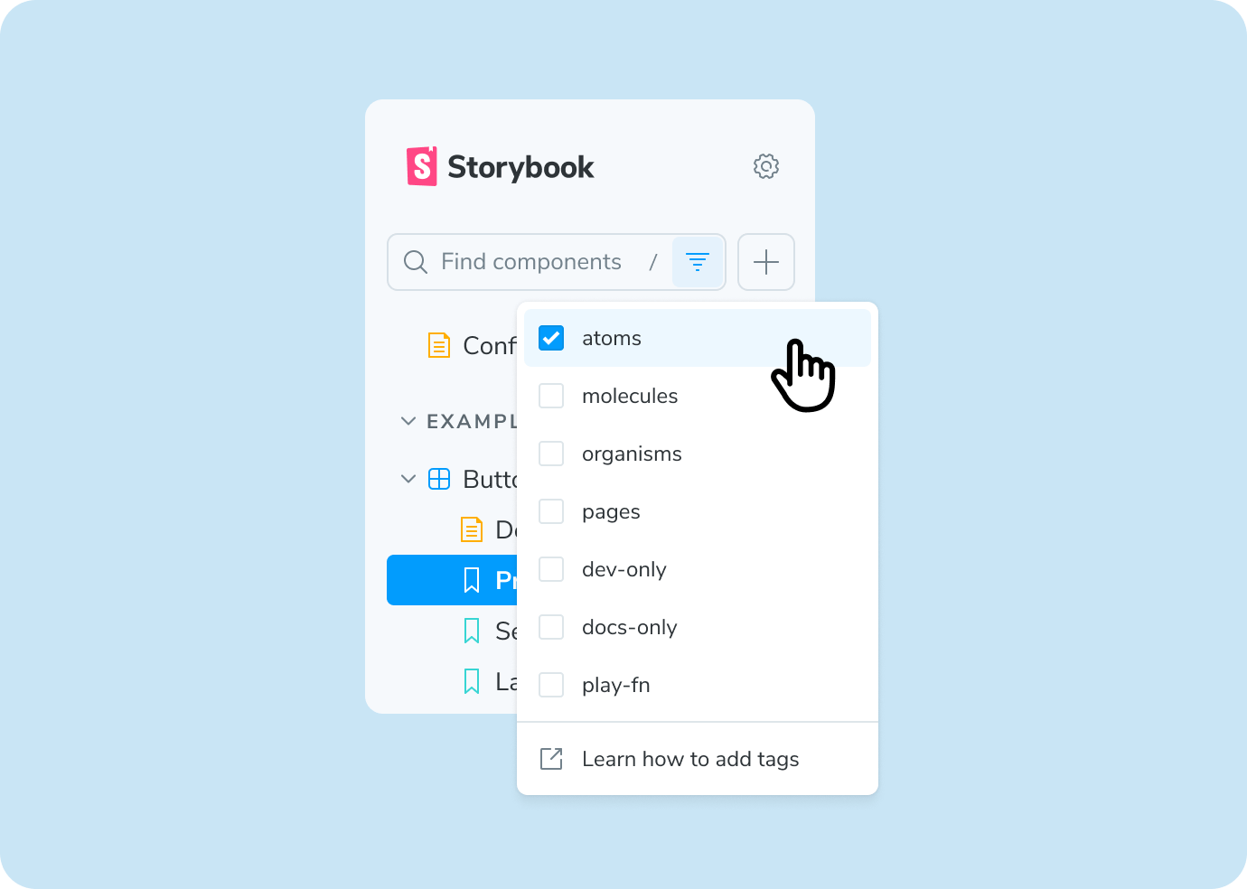
- 🏷️ Tag-based organization: Filter and group stories by tag
- 🌐 Story globals: Set context (theme, viewport, locale) at the story level
- 🏗️ Frameworks: Major updates for Svelte, Next.js, React Native, and more!
Say hello to Storybook Test
In Storybook 9, we teamed up with Vitest, the ecosystem’s fastest test runner, to create a superior tool for testing components. Kick off tests across all your stories at once. Enable "Watch mode" to run only the relevant tests when you save a file.
Why test components?
Unit tests validate logic; E2E tests are best for a few key flows. Storybook Test covers the middle – your components. Component tests hit the sweet spot between the speed of unit tests and the in-browser fidelity of end-to-end (E2E) tests, while avoiding the downsides.
Storybook is the perfect tool for testing components because stories already express every variation, so adding tests to those variations is easy. This allows your test suite to scale to thousands of UI states with minimal maintenance.
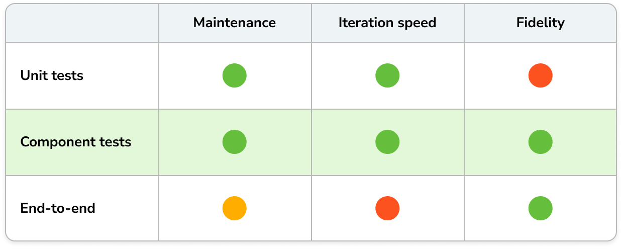
The 3 main types of frontend tests
In frontend development, there are three key dimensions that your users interact with. Storybook runs tests against these dimensions in local development and CI.
- Interaction tests – Does it work?
- Accessibility tests – Can everyone use it?
- Visual tests – Does it look right?
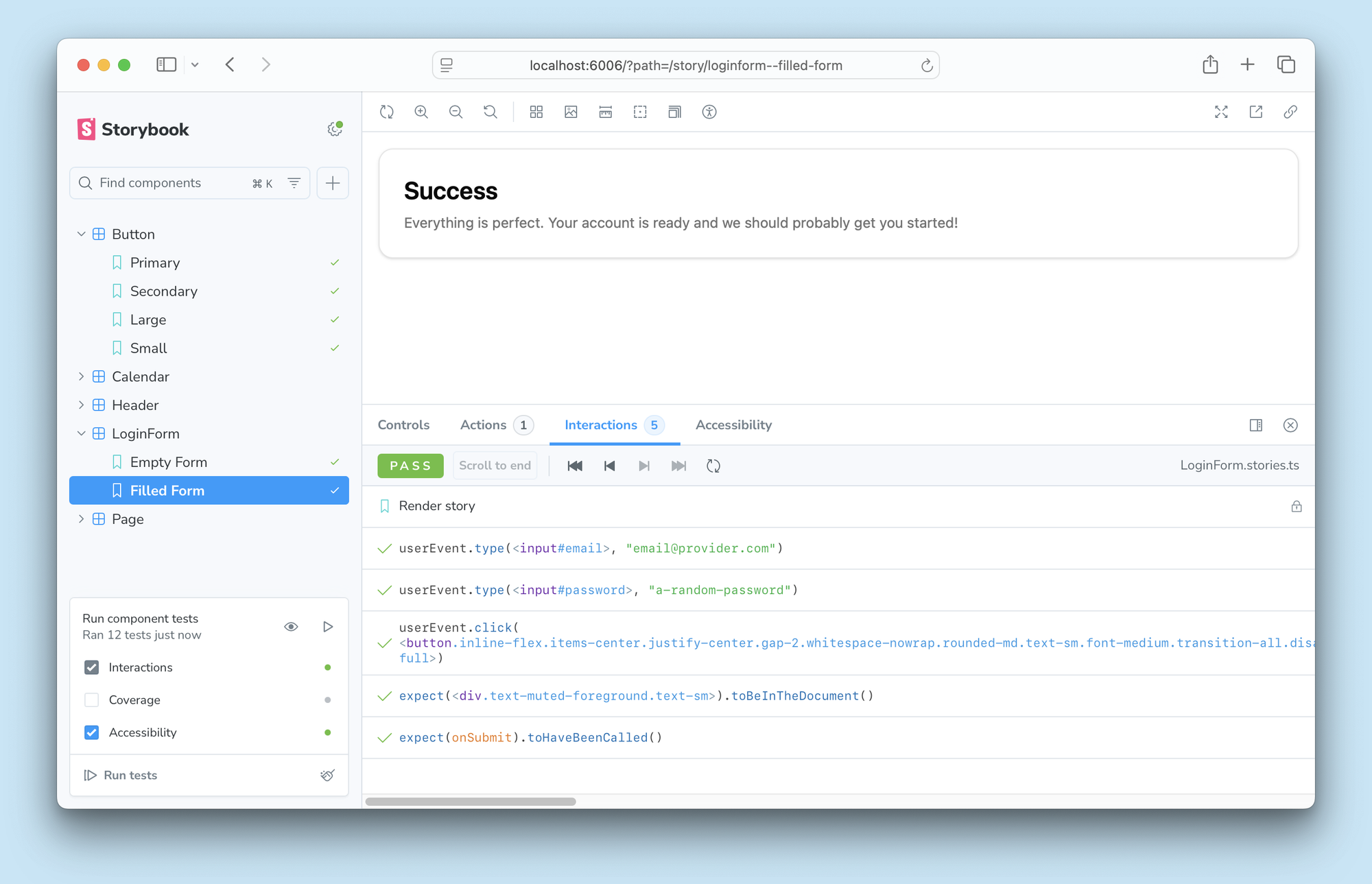
Interaction tests
Interaction tests simulate user behavior and assert that the component functions as expected. Storybook has supported this for years, but you could only run these tests when you navigated to the story. Now you can run all interaction tests across all your stories with a single click and report test statuses in the sidebar.
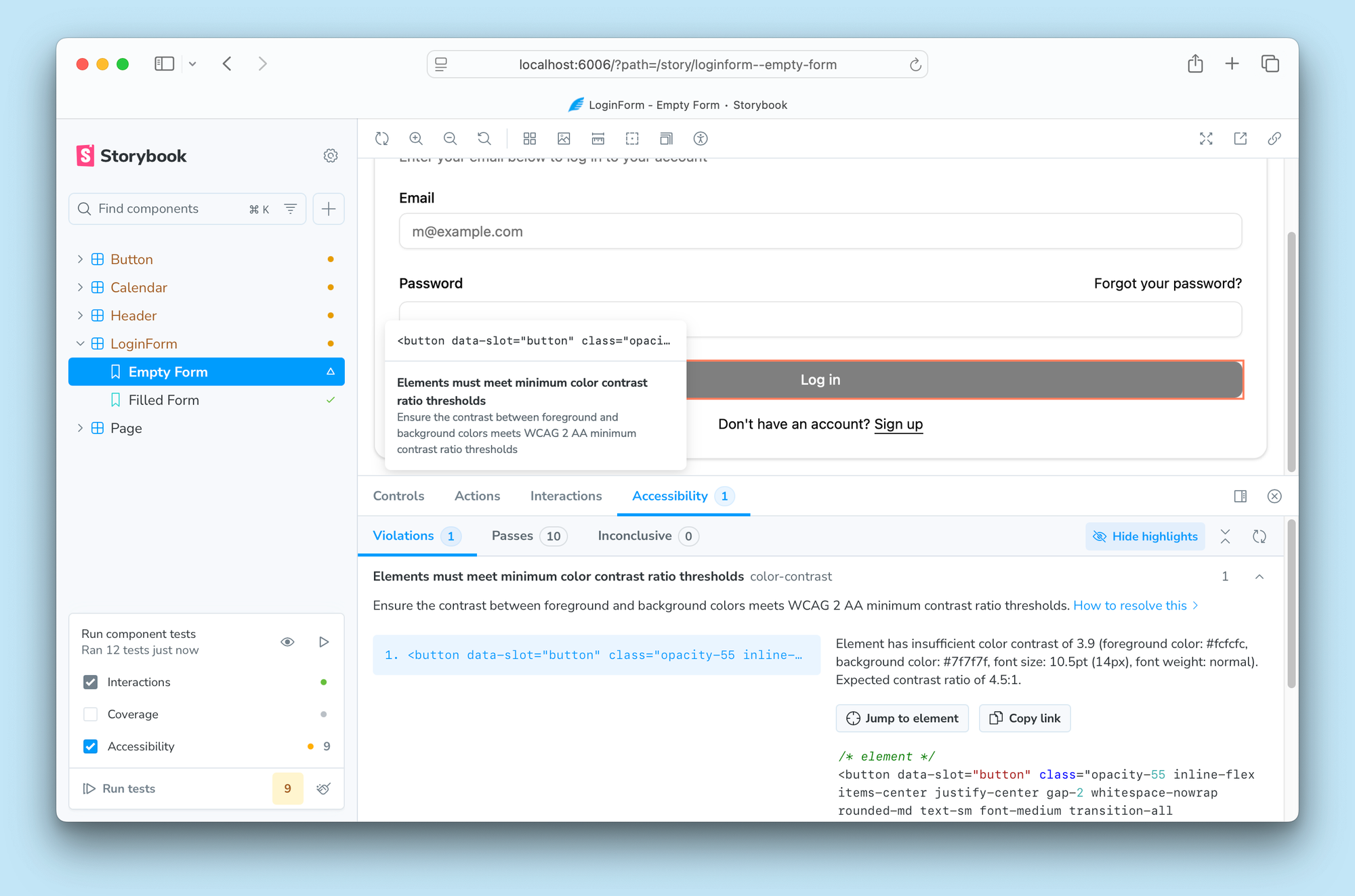
Accessibility tests
Accessibility compliance is essential for modern frontends. But traditional accessibility testing methods are too late, too slow and expensive for too little coverage. Storybook lets you run accessibility tests across all your stories simultaneously and inspect the violations directly in your browser. This way, you catch WCAG violations early in the development cycle. These checks are implemented by axe-core, the industry standard tool.
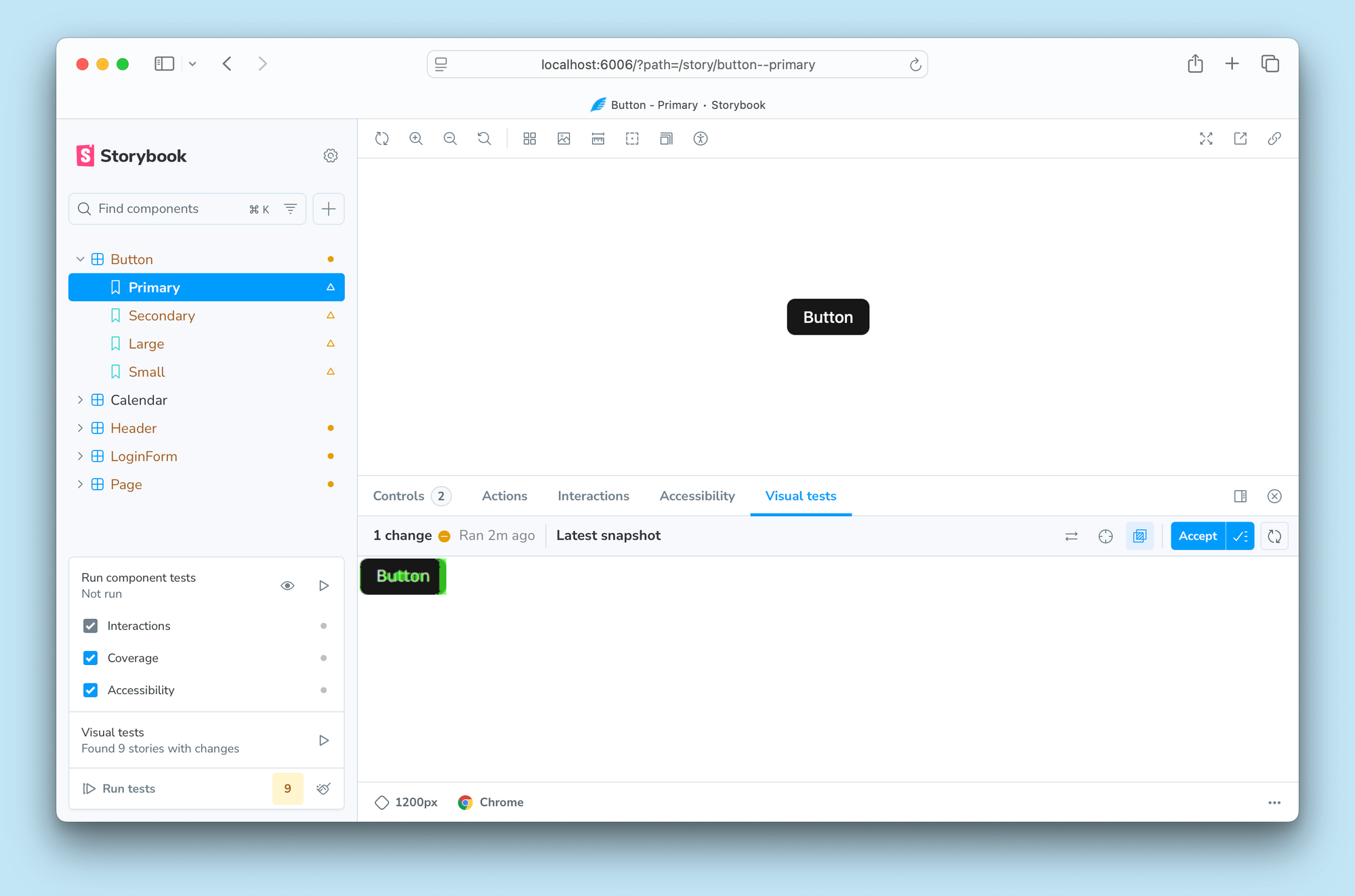
Visual tests
Visual bugs ruin even the best frontends. Storybook helps you prevent bugs by scanning all your stories to pinpoint UI changes down to the pixel. Powered by Chromatic, the visual testing cloud service made by Storybook maintainers.
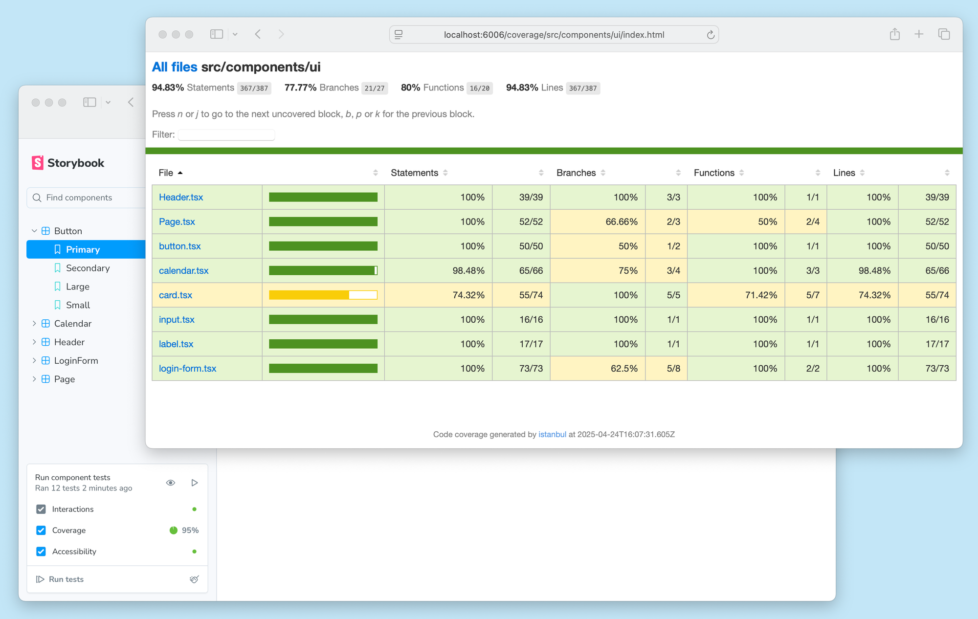
Test coverage
Storybook’s superpower is that you can test all the UI states in your application, not just happy paths. But how do you know if you've tested everything? That's where test coverage comes in. Compute exactly which lines, functions, and branches are exercised by your component tests.
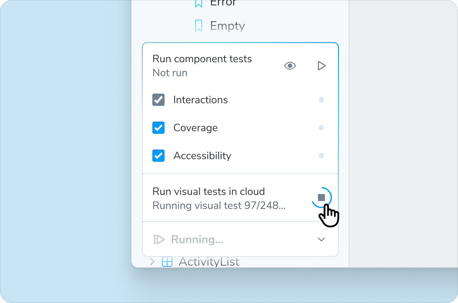
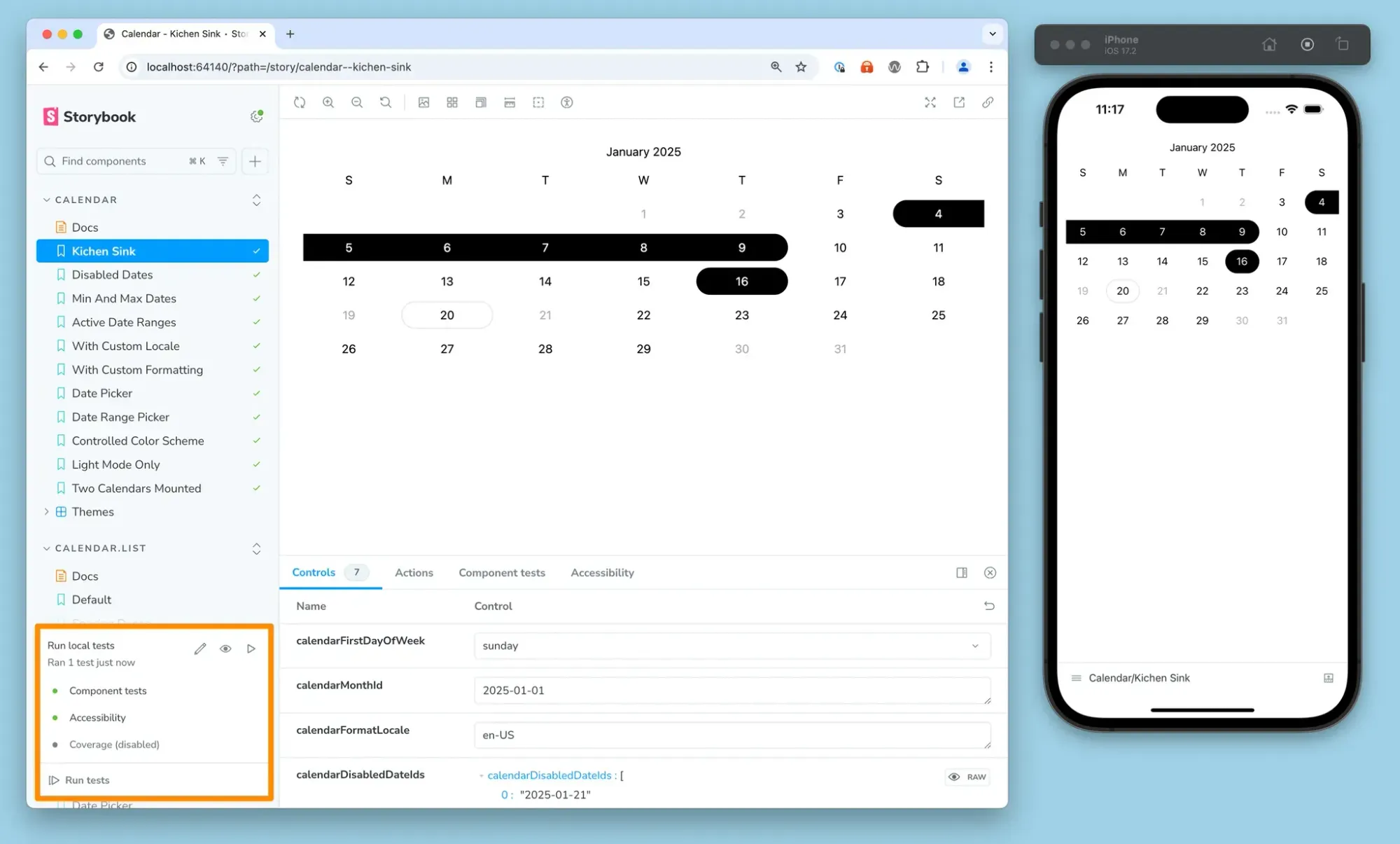
Test Widget: Click to test everything
The Test Widget anchors Storybook Test. Run all tests across all stories—or configure which types to run. You can then filter the sidebar to only show stories with warnings or errors. Each test type has its own debug panel. Since Storybook runs in your own browser, you can also debug using browser dev tools.
Core upgrades
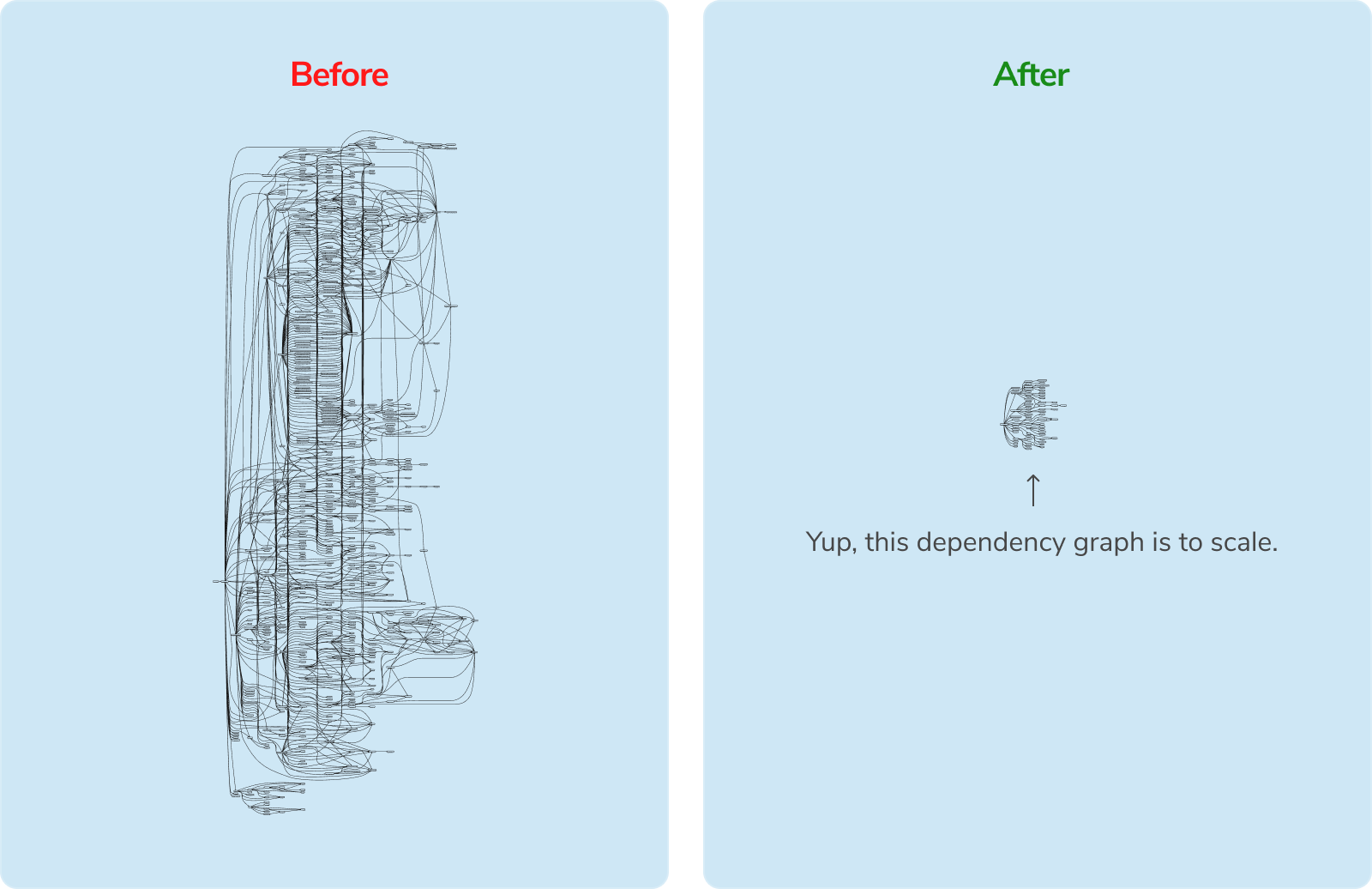
48% Leaner
Storybook 9 is less than half the size of Storybook 8 with a flatter dependency structure that prevents conflicts in your package.json. The lighter weight also results in a faster install.
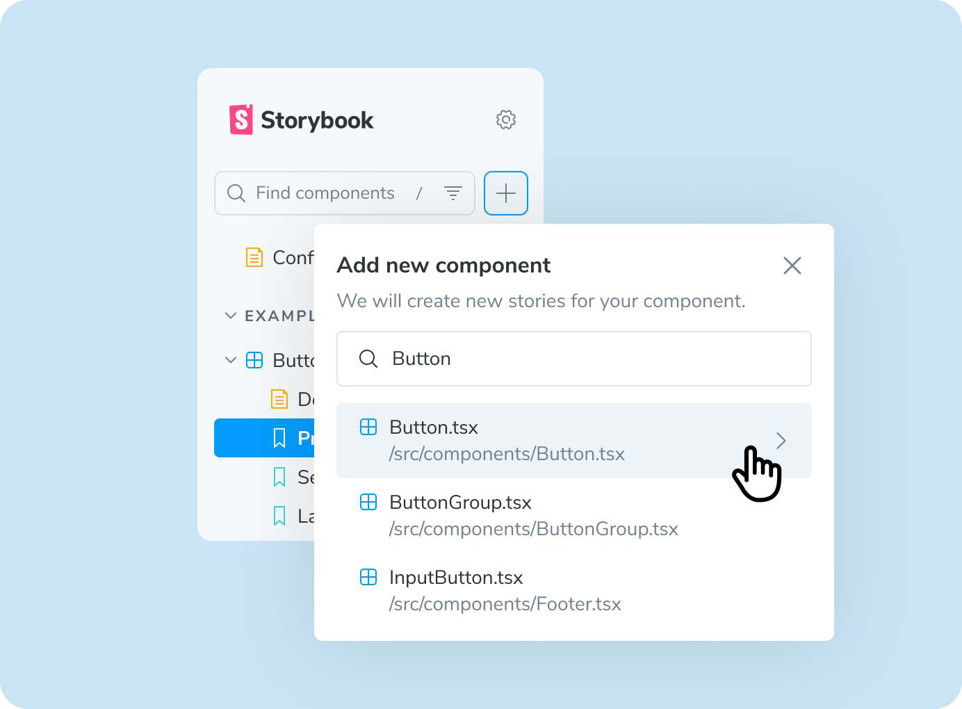
Story generation
Storybook 9’s story generation allows you to create and edit stories from the UI, to capture every state of your component. With the new Test Codegen addon by Igor Luchenkov, you don't need to write code to test your components either. You can record your interactions with your component, add assertions, and save your test... all without leaving Storybook.
Tags-based organization
Tags help you to organize and filter stories and components in large Storybooks. Tag stories based on status (alpha, stable, deprecated, etc.), role (design, dev, product), team, feature area, or whatever fits your needs. From there, you can filter the sidebar by tag or even show tags as badges using the Storybook Tag Badges addon by Steve Dodier-Lazaro.
Story globals
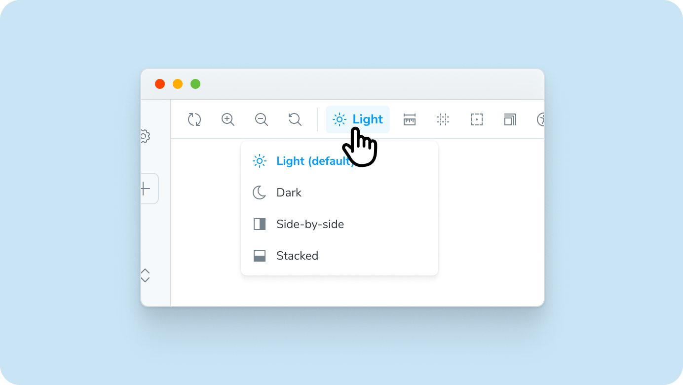
Story globals let you set context variables—like the theme, viewport, locale, or background—on a per-story or per-component basis. That makes it easy to test and document your UI under real conditions: dark mode, mobile view, right-to-left locale, and more.
// Button.stories.ts
export default { component: Button };

// Normal story: theme is configurable in UI
export const Default = { args: { label: 'Button' } };

// 🌎 Force this story to be in the "dark" theme
export const Dark = {
  ...Default,
  globals: { theme: 'dark' }
};
Framework improvements
Storybook supports every major frontend web framework and 9.0 has major quality of life improvements across them all.
Vite-powered Next.js
@storybook/nextjs-vite is a new, instant-on evolution of Storybook’s Next.js framework. It has the same features (Navigation/Route mocking, Image and Font components, etc.) as its Webpack-based predecessor. But since it’s based on Vite, it provides a modern development experience that is fully compatible with Storybook Test and Vitest.
Svelte 5 support
The Svelte CSF story format has been upgraded to Svelte 5, including support for new language features like runes and snippets.
<Story name="Default" args={{ exampleProp: true }}>
  {#snippet template(args)}
    <MyComponent {...args}>Reactive</MyComponent>
  {/snippet}
</Story>
React Native everywhere
Storybook React Native and React Native Web can now run side-by-side in your mobile project. So you can develop components in full fidelity on devices and simulators. But you can also document and test those same stories using the full feature set of Storybook for Web.
Try Storybook 9 today
Try it in a new project:
npm create storybook@latest
If you have an existing Storybook project, use our automated migration wizard to help you along the way:
npx storybook@latest upgrade
We also provide a migration guide to help fill in the gaps.
What’s next?
With overwhelmingly positive pre-release responses to Storybook Test and our bundle size reductions, we plan to double down in 9.x.
- ESM-only to further reduce install size and complexity
- Streamlined module mocking
- Better typesafety and autocompletion for stories
For an up-to-date view on what we’re working on, check out Storybook’s roadmap.
Credits
Core team
Michael Arestad, Yann Braga, João Cardoso, Tom Coleman, Norbert de Langen, Kyle Gach, Gert Hengeveld, Dom Nguyen, Valentin Palkovic, Kasper Peulen, Jeppe Reinhold, Lars Rickert, Kai Röder, Michael Shilman (me!), Varun Vachhar, Ian Van Schooten, Daniel Williams, Josh Wooding, and Vanessa Yuen
Contributors
@acusti @agentender @alirezaebrahimkhani @ashphy @audie80 @b0g3r @benmccann @dannyhw @dummdidumm @edbzn @fi3ework @filipemelo2002 @flaval @gchqdeveloper548 @ghengeveld @guria @hakshu25 @iineineno03k @irinaklimova @jamesives @jonniebigodes @jreinhold @jsmike @kasperpeulen @kenrick95 @kroeder @kylegach @larsrickert @laupetin @leeovictor @leoeuclids @makotot @masstronaut @mrginglymus @muhdhishamp @ndelangen @netroy @notwoods @okathira @rchaoz @robertisaac @sentience @shilman @sidnioulz @sookmax @spanishpear @tmeasday @tomkalina @valentinpalkovic @vanessayuenn @webpro @wlewis-formative @xeho91 @yannbf @yatishgoel
Storybook 9 is here! ▶️ Interaction tests ♿ Accessibility tests 👁️ Visual tests 🛡️ Coverage reports 🚥 Test widget 🪶 48% Leaner ✍️ Story generation 🏷️ Tag-based organization 🌐 Story globals 🏗️ Major updates for Svelte, Next.js, React Native, and more! Let’s dive in!
— Storybook (@storybook.js.org) 2025-06-03T17:05:00.092Z